Stats
Engagement
+2%
WAU
Engagement
+36%
MAU
Feature Adoption
+14%
Channel Initiated Recommendations
Acquisition
2.5x
User Growth in 6 months
Overview
Customers are savvy about the rise of sponsored content, tweets, and influencer posts. Masse [mæs] was created to combat these fake product reviews, as a community of users who recommend products from their genuine appreciation for them. The mission for this pre-revenue-generating startup was to become the largest source of truth for product recommendations online.
On average only 6% of contributors made more recommendations the following week. Our goal was to increase WoW activity to 50%.
By implementing user-friendly methods of personalization, users will discover relevant threads, and pay it forward by making a recommendation.
Mallory and Ally are super users (the top 10% of users) who stimulate activity on the app by providing their product recommendations. These individuals are motivated by helping others or 'influencing' with their unique expertise in a given topic.
•
The volume of content has become unmanageable. Finding relevant content is a daunting task
•
Users expect to see a curation of products like that of our advertisements on Instagram
In February 2020, Channels were responsible for 14% of initiated recommendations. By May 2020 Masse had accumulated ~86k recommendations from ~100k users and, 43k unique products from 12k brands. In 6 months, experiments were conducted to confirm 5 personalization hypotheses. Masse closed due to shifts in funding caused by the COVID-19 pandemic
Features

fig. 1. The 1st step in the Ask Flow.
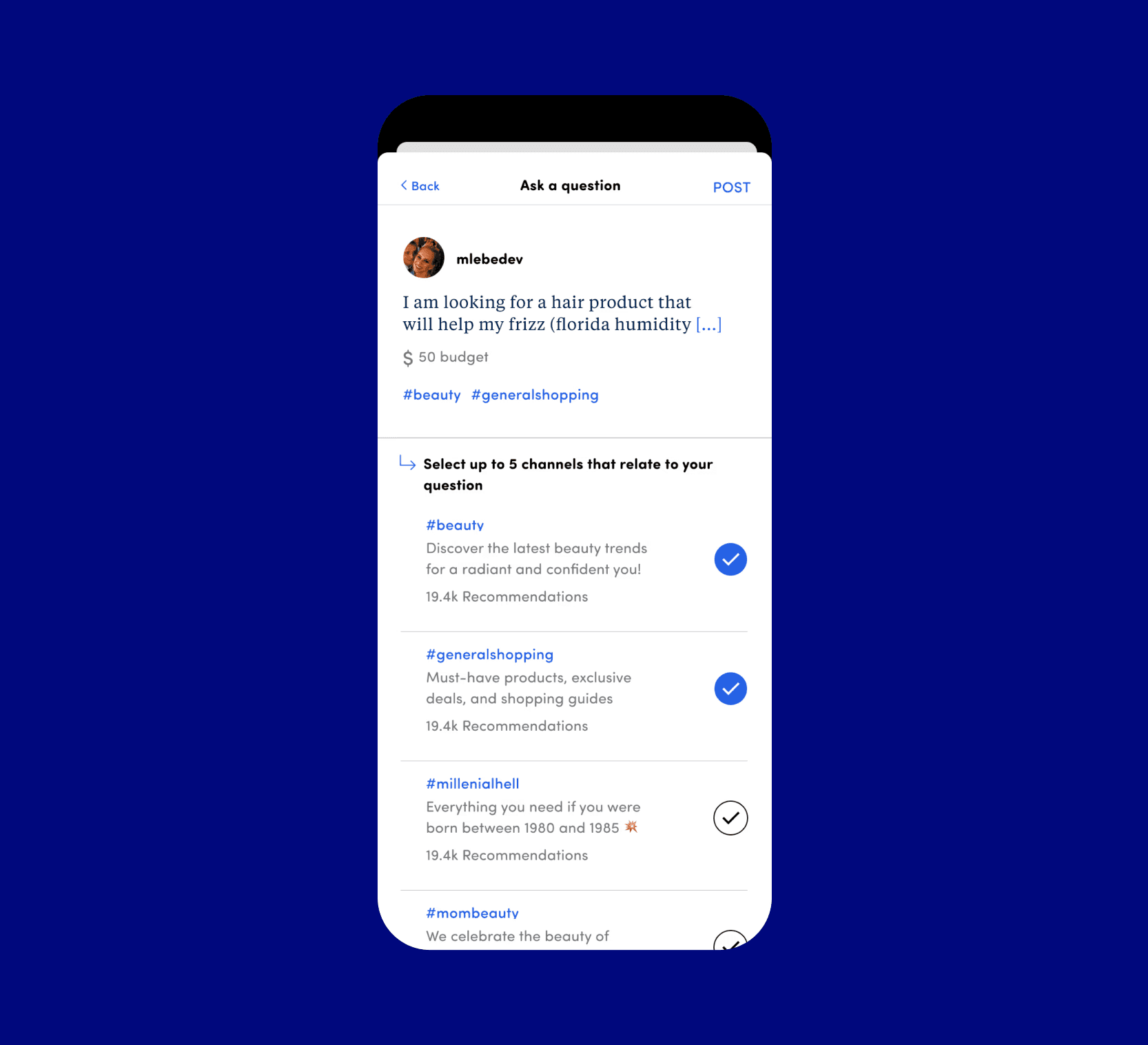
fig. 2. The 2nd step in the Ask Flow to tag channels for greater reach.
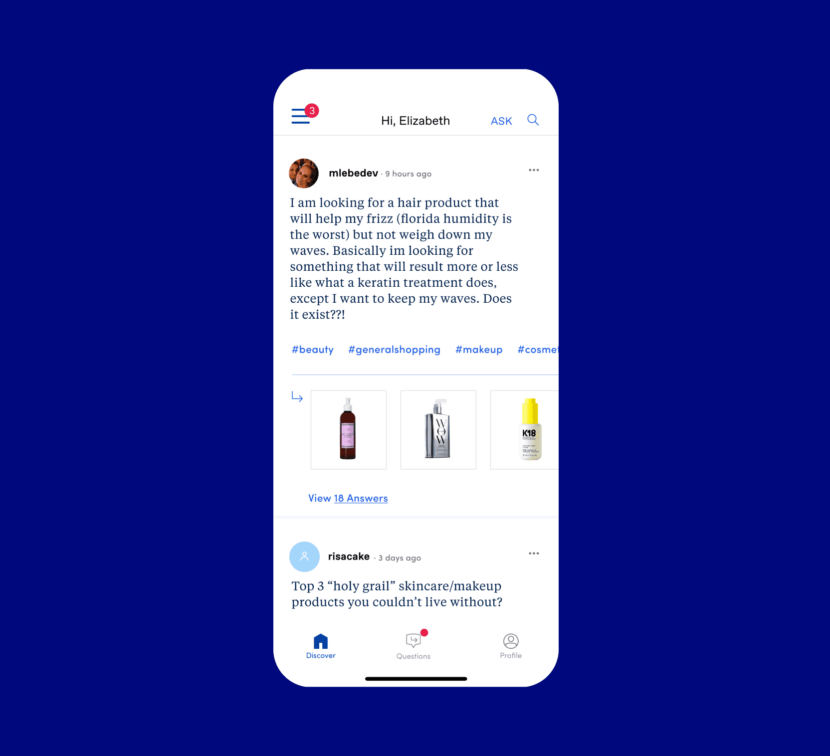
fig. 3. Channels appearing in posts on the feed.

fig. 4. A channel page sorted by top products.
Problem
Super users expressed feeling overwhelmed by the continuous stream of questions. While they enjoyed offering answers and recommendations, the constant influx led to fatigue, raising concerns about potential disengagement. To prevent losing their valuable participation, it became imperative to streamline their content discovery process.
Solution
Leveraging Natural Language Processing to extract keywords from user questions to suggest channels was our approach. It could connect users with the right audience, and decrease response times in making a recommendation (80% of questions were answered in 24 hours). Although there were drawbacks to putting our spin on using Channels*, NLP had the potential to enhance the overall user experience, fostering a dynamic and responsive community.
*Channels were known to tie the physical world with it's digital counterpart. In early testing there was confusion in how we applied the use of hashtags to the mobile app.
Features


Before and after of the hamburger nav featuring channels.
Problem
With the release of channels, we featured them prominently in the navigation. Users voiced their anxiety regarding managing their lists and generally found it confusing.
•
4/6 user testers stated that they would not continue to read unread channels
•
1/6 users expected to see a regular navigation
I'm not sure what 'My Channels' is. I'm guessing it's either what I posted to and suggested as one of the things that I should follow."
– Female, 24
“I assumed the hamburger menu was going to give me account information or maybe some search options.
– Female, 35
Solution
Although we took inspiration from leading community-based applications such as Slack and Discord, our initial approach did not resonate with the user's mental model. Users, as it turned out, were more familiar and comfortable with navigation styles reminiscent of those found on e-commerce websites. Channel navigation was not the preferred route of exploration; instead, there was a notable increase in traffic to the search feature.
Features


At the top is the first step in the Recommendation Flow. Below is the Recommendation Flow Fallout slide from the Q1 2020 Recommender Behavior report.
Problem
In Q1 of 2020, we saw that 29.6% of unique users dropped off at the first step when making a recommendation. This was primarily attributed to the cumbersome nature of searching for a product. Users found it challenging as they had to rely on their memory to retain their thoughts while reading detailed instructions on why and how to complete the task.
•
3/25 user testers typed their answer directly into the search field
•
Super users will recommend the same product over and over again
For items that I feel strongly about, I’ll make a rec and copy it and paste it into my notes on my phone so that I can recommend it again.
– Lynette, 43
Solution
Repeating familiar design patterns reduced the cognitive load for users, making it easier for them to focus. The flow was placed in a native modal window featuring a layout with clear signposts such as section headers and large buttons. This played a crucial role in immediately setting user expectations.
The inclusion of a product grid showcasing previously recommended products bypassed multiple steps and potential drop-off points. Twenty-five user testers completed the task, resulting in a 100% completion rate.
Reflection
I conducted a workshop to foster alignment on quarterly goals and generate ideas for our initiatives. Beginning with overarching business objectives and the aspiration to boost week-over-week contributor retention, we ascended the Abstraction Ladder to recognize the need to demonstrate positive indicators of stickiness for potential investors. This process helped illuminate the specific elements that would capture investor interest.
Descending the ladder, we delved into user-focused themes, uncovering deep-seated negative perceptions that users held, particularly regarding time-consuming interactions. We uncovered the most valuable conversion moment—when a user's question received multiple answers, signifying a heightened level of personal engagement. Capitalizing on this moment we explored strategies to present users with both easy and challenging questions, ensuring sustained engagement and a positive user experience.
This Abstraction Laddering approach facilitated a comprehensive understanding of our goals and paved the way for innovative ideas to enhance our platform.
What They Say